iPad Mockups for Investor Demos: Balancing Realism with Confidentiality
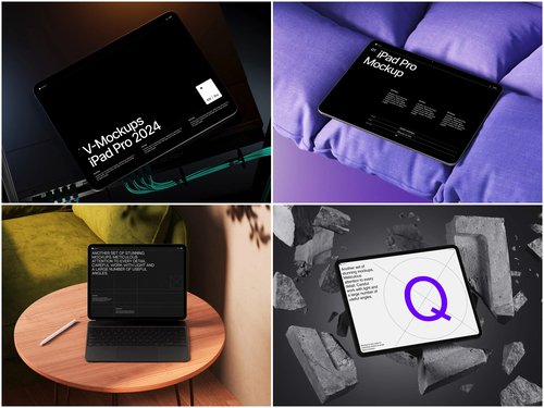
Pitching a product before it’s finished is one of the oldest problems in startup life. Investors want to see something tangible, but founders often can’t hand over a working build without risking leaks, NDA headaches, or half-baked UI that undermines confidence. This is where a well-made iPad mockup earns its place in the toolkit — it lets a team present a polished, believable product experience without exposing the actual codebase or sensitive backend data.
Why Founders Reach for Mockups Instead of Live Demos
Live demos are fragile. A dropped connection, a laggy prototype, or an accidental glimpse of test data can derail an otherwise strong pitch. Founders who’ve raised seed or Series A rounds frequently mention rehearsing pitch decks around static or lightly animated device renders instead of gambling on a live app.
A few practical reasons this approach persists:
- Control over what’s shown. A mockup displays exactly the screens a founder wants investors to see — no stray console errors, no unfinished settings pages.
- Consistency across meetings. The same clean visual can be reused in decks, one-pagers, and follow-up emails without re-recording anything.
- Speed. Designers can drop a UI screenshot into a device frame in minutes, rather than building a working demo environment for a five-minute meeting.
This isn’t about deception — investors know they’re looking at a rendered concept. It’s about presenting a product vision clearly, the same way architects use renderings before a building exists.
Realism Without Revealing the Roadmap
The tension in the brief is real: investors respond better to visuals that look like an actual device in someone’s hands, but too much realism can accidentally expose proprietary details if screens are pulled directly from a live, data-connected build. Smart teams solve this by populating mockups with representative but fictional data — sample names, placeholder metrics, generic client logos — while keeping the interface design itself authentic.
This is a common move in fintech and healthtech pitch decks, where actual account numbers, patient records, or transaction histories obviously can’t appear on screen. Instead, teams design a UI that behaves and looks exactly like production software but is filled with dummy content that’s been scrubbed of anything identifiable. The device frame itself, meanwhile, still needs to look convincingly real — reflections, shadows, and proportions matter more than people expect, because a flat, obviously fake-looking tablet image undercuts the credibility of everything inside it.
Where Designers Actually Source These Frames
Rather than photographing physical devices for every deck, most design and product teams pull from prebuilt asset libraries. A high-quality iPad mockup template gives founders a photorealistic device shell — accurate bezels, screen glare, and camera details — that a UI screenshot can be dropped into using layered PSD or Figma files. This saves the cost of a dedicated product photography session and keeps the visual quality consistent across every slide in the deck.
Studios like ls.graphics have built a reputation specifically around this kind of asset: clean, layered mockup files designed for product and marketing teams who need believable device presentations without commissioning custom photography for every iteration of a pitch deck.
Real Situations Where This Matters
A few patterns show up repeatedly across early-stage companies preparing for fundraising:
App-based startups pre-launch. A team building a consumer app often doesn’t have a stable build ready months before their target close date. Instead, their UX designer exports high-fidelity screens from Figma and places them inside a tablet frame for the deck, giving investors a tactile sense of the product before a single line of production code ships.
Internal tools going external. Companies that started with an internal dashboard and are now pitching it as a standalone SaaS product frequently need to mask client names, dollar figures, and internal jargon before showing it externally. Swapping the live dashboard for a mockup populated with synthetic data solves this cleanly.
Hardware-adjacent products. Founders building physical devices with companion apps often mock up the tablet interface long before the companion software is stable enough to demo live, since the hardware and software timelines rarely align perfectly.
Agency and freelance pitch work. Design agencies preparing client-facing case studies use the same technique — showing a finished-looking product screen inside a professional device frame carries more weight in a portfolio than a plain screenshot ever does.
Getting the Balance Right
The goal isn’t to fool anyone — investors are sophisticated enough to know a mockup when they see one. The goal is professionalism: showing enough visual polish that the product feels real and considered, while keeping any sensitive detail — user data, backend logic, unreleased features — out of the frame entirely. Teams that get this balance right tend to walk into meetings with more confidence, because the visual story supports the pitch instead of creating new risks. In fundraising, where trust and clarity often decide outcomes, that’s a small design decision with outsized returns.